Thursday, May 23, 2013
Note to self: Solarol does not last
That's it really--all I wanted to say or note at this point: Solarol does not stand the test of time. We mixed up the can (the whole can, mind you) at the end of January and when I went to get some of the stock last weekend (mid-Mayish) it had turned a beer-piss brownish-yellow color. The chemicals were still able to impact the prints, but it took longer and the Mackie line effect wasn't nearly as rich or contrasty. So yeah. I ordered another can--mainly because this stuff is getting harder to find--but this time around, I won't prep the whole can but measure the two powders out and mix smaller, hopefully single-use, batches.
Monday, January 28, 2013
Fun with Solarol
Thank goodness for getting-around-to-it kinds of weekends. Long story short, we've had the darkroom set up in the new place for months now, but there wasn't time (or, really, a good excuse) to test it out. And truth is, I tend to avoid change (or learning new things) and I was still used to working with the much smaller, far less high-tech enlarger we'd picked up two-plus years ago for 30 bucks at the junk shop in Maine.
When Chris scored this Super Chromega D Dichroic II color 4x5 enlarger right before Valentines Day, 2011, I was too afraid to use it. He got the set up for a steal (about 200 bucks) and the owner thru in a bunch of extras (i.e., in addition to various sized negative carriers and a really excellent lens, he threw in four 50 sheet 11x14" boxes of expired Agfa-Gevaert Portriga-Rapid paper, one 50 sheet 11x14" box of expired Ilford Multigrade IV RC paper, one 100 sheet 8x10" box of expired Ilford Multigrade IV RC paper, one 100 sheet 8x10" box of expired Agfa-Gevaert Brovira, one 100 sheet 8x10" box of expired Kodak Polycontrast Rapid RC paper, and one 100 sheet 8x10" box of expired Kodak Panalure. As for the misc stuff, we got one 4x5 film holder, one stainless steel 35mm reel, one box of farmer's Reducer, and a set of 12 6x6 Ilford Multigrade filters.) Needless to say, Chris' Valentine gift made mine (I decided to surprise him by giving the dog a bath) seem far less thoughtful or romantic.
Fast forward almost two years: Having little (read: nothing, really) completed in prep for my CCCC presentation (and having become increasingly worried about being in that nothing-really kind of state) provided me with an excuse to get into the darkroom again and (more importantly, perhaps) to learn how to use the much bigger, much scarier, enlarger. Briefly stated, my presentation will center on the idea of giving voice and movement to (or making one's own) strangers' otherwise silent/static memory objects. Though I'm still not sure where I'm going, I had a sense of how I wanted the piece to begin. To this end, I spent most of the week going through a collection of found negatives, ultimately deciding that I'd work with this image--one of a father, his two daughters, and headless wife.
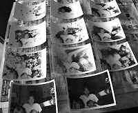 As a means of underscoring visually something of the difficulty, mystery and, indeed, frustration, of working with other people's memory objects, I wanted to make multiple copies of the image, using a selective development technique to reveal only portions of an image at a time. The argument here is basically that you get to see/recognize/put into a kind of order that makes sense only small portions of those faces, bodies, lives and experiences at a time. But the more you look--that is to say, what you think you know at a given point in time is often complicated when you try to factor in other items in the collection. In this way, things often seem to become clearer, only to then get all muddied up, confusing and obscured as other things as revealed. I want to suggest that working with still images, as I'm doing here, allows you to see different things in different ways and at different times but, of course (and here's one of the main points of the presentation), those things always remain still, always silent. Again, what I hope to do with these strangers' stills is to provide them movement, sound, juxtapose them with other stories.
 New processes, especially those that involve chemicals (or sharp objects and/or fire) are always scary business for me--I worried that I'd botch the mixing, that I'd poison myself (or Chris or the cats, or Dorothy). And then there is the business of mastering the mechanics of the process: Were we using the right filter? Were our exposure times off? Were we using the right development times? Was the light we'd use to flash the half-developed prints at the right height, the right wattage? etc. It bothered me too that we'd likely waste a lot of paper learning this new technique. [A somewhat silly concern since we've been hoarding paper like crazy for the past few years and probably have more than we'll ever have a reason to use. . .but still. I worried about the waste, but ultimately reasoned that wasting stuff is often part of the learning process.] It took us a couple (well, really, more than a couple) tries to get our
timing down, but we were happy with the results. Otherwise put, most of
the images didn't look like they'd been developed with regular
developer and we never dropped the secondary light source in the
developer tray. For our first few attempts we worked with b/w negatives--it's what we had handy (see images above, left). We then dug out and switched to infrared images as they tend to provide more interesting or extreme results (see two images below).
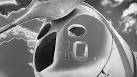 I was curious to see what the developer would do as it became increasingly exhausted. (We'd developed at least 30 prints with the first batch of chemicals--most prints were 5x7 but a few were 8x10.) I'd read that the pseudo-solarization effect would become more extreme as the chemicals became more exhausted. With a mind to not wanting to waste more stuff than I had to, I was curious to see what exhausted AND day old Solarol might be capable of. Given that most mixed developers are only good for about eight hours (or so they say), I didn't expect that the day old chemicals would produce any kind of image. . .at least not in a timely fashion. I was surprised, however, to find that we were able to produce more images the next day and without having to alter our exposure or development times (see infrared image above, left).
 It took some time (and even now, I'm not sure I have this all straight in my head) to figure out how longer vs. shorter exposure times impacted the sabattiered images. To this end, we thought it would prove helpful to experiment with different exposure/flash times. For this first test
strip, we used a b/w image I recently made on a trip to Boston. The top
image was exposed for 10 seconds, developed for 35 seconds, and then
flashed with a 25 watt bulb for 1.5 seconds. The middle image was
exposed for 7.5 seconds, developed for 35 seconds, and then flashed with
a 25 watt bulb for 2 seconds. The bottom image was exposed for 5
seconds, developed for 35 seconds, and then flashed with a 25 watt bulb
for 2 seconds.
For the second test strip, we used a b/w image I made this summer in Baltimore. The top image was exposed for 15 seconds, developed for 35 seconds, and then flashed with a 25 watt bulb for 2 seconds. The middle image was exposed for 10 seconds, developed for 35 seconds, and then flashed with a 25 watt bulb for 2 seconds. The bottom image was exposed for 7.5 seconds, developed for 35 seconds, and then flashed with a 25 watt bulb for 2 seconds.
Exposure times are, of course, predicated upon paper speed and negative thinness or density, but what we seemed to be finding is that the shorter exposure times resulted in the more extreme (solarized/reversed) images. Also, with a mind toward using chemicals past suggested times, I'd note here that after 24 hours the mixed Solarol was turning a bit dingy, but still was mostly clear. After 36 hours it had become very dark--purplish. I expect it has been pushed far past its use and I doubt that I could get an image from it today.
Next up on the experimental front: Fun with Liquid Light.
When Chris scored this Super Chromega D Dichroic II color 4x5 enlarger right before Valentines Day, 2011, I was too afraid to use it. He got the set up for a steal (about 200 bucks) and the owner thru in a bunch of extras (i.e., in addition to various sized negative carriers and a really excellent lens, he threw in four 50 sheet 11x14" boxes of expired Agfa-Gevaert Portriga-Rapid paper, one 50 sheet 11x14" box of expired Ilford Multigrade IV RC paper, one 100 sheet 8x10" box of expired Ilford Multigrade IV RC paper, one 100 sheet 8x10" box of expired Agfa-Gevaert Brovira, one 100 sheet 8x10" box of expired Kodak Polycontrast Rapid RC paper, and one 100 sheet 8x10" box of expired Kodak Panalure. As for the misc stuff, we got one 4x5 film holder, one stainless steel 35mm reel, one box of farmer's Reducer, and a set of 12 6x6 Ilford Multigrade filters.) Needless to say, Chris' Valentine gift made mine (I decided to surprise him by giving the dog a bath) seem far less thoughtful or romantic.
Fast forward almost two years: Having little (read: nothing, really) completed in prep for my CCCC presentation (and having become increasingly worried about being in that nothing-really kind of state) provided me with an excuse to get into the darkroom again and (more importantly, perhaps) to learn how to use the much bigger, much scarier, enlarger. Briefly stated, my presentation will center on the idea of giving voice and movement to (or making one's own) strangers' otherwise silent/static memory objects. Though I'm still not sure where I'm going, I had a sense of how I wanted the piece to begin. To this end, I spent most of the week going through a collection of found negatives, ultimately deciding that I'd work with this image--one of a father, his two daughters, and headless wife.
 As a means of underscoring visually something of the difficulty, mystery and, indeed, frustration, of working with other people's memory objects, I wanted to make multiple copies of the image, using a selective development technique to reveal only portions of an image at a time. The argument here is basically that you get to see/recognize/put into a kind of order that makes sense only small portions of those faces, bodies, lives and experiences at a time. But the more you look--that is to say, what you think you know at a given point in time is often complicated when you try to factor in other items in the collection. In this way, things often seem to become clearer, only to then get all muddied up, confusing and obscured as other things as revealed. I want to suggest that working with still images, as I'm doing here, allows you to see different things in different ways and at different times but, of course (and here's one of the main points of the presentation), those things always remain still, always silent. Again, what I hope to do with these strangers' stills is to provide them movement, sound, juxtapose them with other stories.
Dealing with two things I'd been putting off for far too long (again, learning the enlarger, committing to an opening visual for my presentation) made it easier to take on a third--trying my hand at sabattier. (too) Simply put, this technique involves exposing developing film (or paper) to a light source during the development process to achieve a psuedo-solarization effect. I had tried my hand at this once before, but I wasn't using the right kinds of chemicals and the prints ended up a muddy mess. I picked up some Solarol in a photo shop in St. Louis about a year ago--this is, in fact, the right kind of developer for this process--and decided to mix some up this weekend.
 New processes, especially those that involve chemicals (or sharp objects and/or fire) are always scary business for me--I worried that I'd botch the mixing, that I'd poison myself (or Chris or the cats, or Dorothy). And then there is the business of mastering the mechanics of the process: Were we using the right filter? Were our exposure times off? Were we using the right development times? Was the light we'd use to flash the half-developed prints at the right height, the right wattage? etc. It bothered me too that we'd likely waste a lot of paper learning this new technique. [A somewhat silly concern since we've been hoarding paper like crazy for the past few years and probably have more than we'll ever have a reason to use. . .but still. I worried about the waste, but ultimately reasoned that wasting stuff is often part of the learning process.] It took us a couple (well, really, more than a couple) tries to get our
timing down, but we were happy with the results. Otherwise put, most of
the images didn't look like they'd been developed with regular
developer and we never dropped the secondary light source in the
developer tray. For our first few attempts we worked with b/w negatives--it's what we had handy (see images above, left). We then dug out and switched to infrared images as they tend to provide more interesting or extreme results (see two images below).
  I was curious to see what the developer would do as it became increasingly exhausted. (We'd developed at least 30 prints with the first batch of chemicals--most prints were 5x7 but a few were 8x10.) I'd read that the pseudo-solarization effect would become more extreme as the chemicals became more exhausted. With a mind to not wanting to waste more stuff than I had to, I was curious to see what exhausted AND day old Solarol might be capable of. Given that most mixed developers are only good for about eight hours (or so they say), I didn't expect that the day old chemicals would produce any kind of image. . .at least not in a timely fashion. I was surprised, however, to find that we were able to produce more images the next day and without having to alter our exposure or development times (see infrared image above, left).
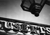
  It took some time (and even now, I'm not sure I have this all straight in my head) to figure out how longer vs. shorter exposure times impacted the sabattiered images. To this end, we thought it would prove helpful to experiment with different exposure/flash times. For this first test
strip, we used a b/w image I recently made on a trip to Boston. The top
image was exposed for 10 seconds, developed for 35 seconds, and then
flashed with a 25 watt bulb for 1.5 seconds. The middle image was
exposed for 7.5 seconds, developed for 35 seconds, and then flashed with
a 25 watt bulb for 2 seconds. The bottom image was exposed for 5
seconds, developed for 35 seconds, and then flashed with a 25 watt bulb
for 2 seconds.
It took some time (and even now, I'm not sure I have this all straight in my head) to figure out how longer vs. shorter exposure times impacted the sabattiered images. To this end, we thought it would prove helpful to experiment with different exposure/flash times. For this first test
strip, we used a b/w image I recently made on a trip to Boston. The top
image was exposed for 10 seconds, developed for 35 seconds, and then
flashed with a 25 watt bulb for 1.5 seconds. The middle image was
exposed for 7.5 seconds, developed for 35 seconds, and then flashed with
a 25 watt bulb for 2 seconds. The bottom image was exposed for 5
seconds, developed for 35 seconds, and then flashed with a 25 watt bulb
for 2 seconds.For the second test strip, we used a b/w image I made this summer in Baltimore. The top image was exposed for 15 seconds, developed for 35 seconds, and then flashed with a 25 watt bulb for 2 seconds. The middle image was exposed for 10 seconds, developed for 35 seconds, and then flashed with a 25 watt bulb for 2 seconds. The bottom image was exposed for 7.5 seconds, developed for 35 seconds, and then flashed with a 25 watt bulb for 2 seconds.
Exposure times are, of course, predicated upon paper speed and negative thinness or density, but what we seemed to be finding is that the shorter exposure times resulted in the more extreme (solarized/reversed) images. Also, with a mind toward using chemicals past suggested times, I'd note here that after 24 hours the mixed Solarol was turning a bit dingy, but still was mostly clear. After 36 hours it had become very dark--purplish. I expect it has been pushed far past its use and I doubt that I could get an image from it today.
Next up on the experimental front: Fun with Liquid Light.
Wednesday, August 29, 2012
An easy-peasy Holga macro mod
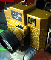 I set out to do some macro work with the Holga yesterday and was really pleased with the results. All images were taken with the bulb setting, on Kodak Ektar 120 film and developed with Arista C-41 chemicals. While this particular post focuses on how to do this really easy macro modification and to determine the point of focus for the modified lens, I'm (perhaps deliberately?) not offering much concrete advice on determining the specific length of exposure one needs to use in order to achieve good results. I consider myself to have gotten lucky when it came to exposure times, since this was all guess work on my part. What worked for me--what worked for the conditions I was working with/in--was an exposure time of approximately 3-5 seconds. The images were a bit over-exposed, but they scanned well, and I didn't need to do much adjusting of levels. Note: I took all the images inside, in front of a sliding glass door on a sunny day. For some shots, I got a little extra help from a diffused external light (an old Movie Light, model G100), but I didn't find this made a huge difference in terms of exposure times.
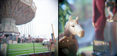
For those unfamiliar with the kind of images an unmodified Holga is capable of making, I offer the following visual comparison below. The image left was taken with the Holga's regular (plastic) lens, the image right is an image made with the x10 filter attached.
As for the details of the macro mod:
Step 1: Affix (with electrical tape) a macro lens to the front of the Holga lens (see images above and below). I find that 52mm filters work really well, size-wise. In this case, I used the x10 magnifying filter, but I've also worked with the x4 filter. Note: It's helpful to use plenty of tape here, especially when using the thicker lenses and/or when shooting outdoors. I did all these shots on the tripod, so I knew the lens was pretty secure, as is.
Step 2: Determine point of focus for the modified lens. To do this, I taped a piece of wax paper to the inside of the Holga (see image below). With the camera set on bulb, I opened the shutter, while focusing on something I'd be able to see through the wax paper. It's helpful to choose something with definition, and something well-lit. In this case, I focused on the knob of my Letertron system. Note: You can produce really compelling images using wax paper or vellum as an alt film plane.
After much hard math and difficult calculations, I determined that the point of focus was approximately the distance of a leopard butter knife (aka 6 inches). Note: I measured the distance from the body of the camera to the object (or part of object) I wanted in focus and not from the lens barrel itself (see image below).
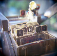 This image (right) resulted from the set-up depicted above.
And this lastly: I offer this (perhaps too-obvious) word of caution when it comes to framing compositions with the close-up lens attached. Working with a six-inch lens to object distance means that Holga's viewfinder will not be accurate--far from it. With these images I had to wing things when it came to framing the composition--I just aimed the taking lens at what I wanted to get in the frame and hoped for the best. Final tip: If (or I should say when) I do this again, I'll definitely think more carefully about the kind and quality of arrangements I choose to photograph with the x10 filter. The depth of field here is, not surprisingly, extremely shallow--I didn't give this enough thought while I creating my mixed/media object compositions. Given the (relatively thoughtless) way I staggered some of the objects in the composition, some of those objects were really fuzzy/distorted and got in the way, so to speak, of my ability to make a decent image. In the case of the image above, I wanted the farm girl figure and gramophone in the shot, but they ended up being so fuzzy and blown out, they really compromise the overall quality of the image. In hindsight, I wish I'd have left them out or positioned them closer to the lens. The object relations in the image below, by contrast, make for a much more compelling image. The horse head, clock, tv, and running man are all, more or less, in focus. The figure in the maroon dress, while out of focus, is large enough and of a strong enough color that it doesn't necessarily take away from the overall quality of the image.
Wednesday, November 2, 2011
Remaking Master Hands, Part III: On projection and the anxiety over proportion
Having decided that one of the main ideas behind the Master Hands project would be projection—projecting the found texts and movie clips so that others could view them, as well as projecting myself into those lives, traveling to the various places those texts might allow me to go—I had to begin deciding which pieces of the collection made the most sense to use and how, specifically, I wanted to use them.
I began re-viewing the home movies I had purchased with a mind toward capturing and cataloging any and all instances of movement or travel—travel by car, certainly, but also boat, plane, whatever. My initial thought was to watch all the movies I had and then, after deciding which clips I wanted to use, go back and re-run those films, recording only what I actually planned on using. After more than a few close calls with misbehaving projectors, willful reels, and lengths of film that jammed and started to burn, Chris and I decided it was probably wisest just to record everything as it ran, deciding later what I wanted to use. We did most of the projecting and re-recording in the living room, using various projectors and a moldy old screen we had purchased at Good Will for three dollars. Chris ran the projector while I recorded what was being projected on the screen using my digital camera, my ipod and some Flip video recorders.
I had a vague sense of wanting to do a video with four sections—a nod to the fact that Master Hands had been divided up into four sections or parts. I knew that I wanted one section to deal explicitly with travel, with being projected or transported from one place to another, and this would likely be the section of the piece that would feature the most of the original source video. To better determine what the other sections would deal with, I began editing and cataloging the re-recorded (i.e., now digitized) home movies according to the different themes or trends I noticed in that footage: travel/vacation sequences, parties or holiday celebrations, people avoiding the camera, people unwrapping presents, people waving hello (or goodbye), footage shot in cemeteries, and so on. At that point, all I knew is that one section of the piece would deal with the idea of projection/transportation (again, working with the idea of tracing the car’s movement or lifespan after it left the factory), that another would deal with resistance or avoidance, and that the final section of the video would feature the Walker Evan’s quote--“Stare, pry, listen, eavesdrop. Die knowing something. You are not here long”--followed by a montage of people waving hello—or depending on how you looked at it—goodbye. I wanted, in other words, for the piece to get to questions of projection, preservation as well as mortality, to get viewers to question who was watching who, whose life was on display, who, in point of fact, would not be here long, whose lives would not be viewed or remembered.
Throughout the process of developing ideas for the piece and then while actually piecing it all together, I continually questioned whether or not I was doing this all correctly. It bothered me a great deal that I couldn’t see or learn what other people were doing, to understand how they were approaching the task. Despite this being labeled as an experiment, and despite being told that I was to use Master Hands plus anything else I wanted, I continually fixated on matters of proportion. Had I been able to see drafts of other people’s work and/or to discuss my plans with others, I could have made sure that I was using approximately as much of the source text as others were. Then again, that said, I had a pretty strong sense of what I wanted to accomplish and a fairly good sense of how I might use Master Hands to help me get there, so it’s quite likely that even if I had learned early on that others were composing pieces that were comprised, say, 75% of Master Hands footage, I wouldn’t have done much differently. On the other hand, had I known from the get-go that my piece would feature much less of Master Hands than other pieces did (provided that this was, in fact, the case), this would, I think, have resulted in less time and stress spent second-guessing my work, wondering if others were using more of the source material than I was, etc.
Throughout the time I spent working on this piece, I continually drew comparisons between this experiment and the show Chopped. For those not familiar with the program, the show requires chef-testants to create a meal (appetizer, entrée and, finally, a desert) using the items found in the mystery basket. Importantly, while the chef-testants must use all of the items in the mystery basket in some way, they are also free to use any of the items found in the Chopped pantry. My sense of this experiment—and the idea of producing mash-ups more generally--was that it was kinda like being on Chopped, only in this case there was only one item—Master Hands—in our mystery basket. That said, there was a particular episode of Chopped that came most often to mind while I worked on this project, serving, I suppose, as a kind of cautionary tale. I don’t remember all the specifics of the episode, but one of the ingredients the contestants had to use was candy cane. If I recall correctly, one of the chef-testants was criticized for offering the candy cane as something of an after-thought, an accessory, or quite literally, a garnish. The item wasn’t, in other words, integrated fully or well enough into the dish. As I thought about what portions (and how much) of Master Hands I’d use in my piece, I remember thinking, “it can’t be like the candy cane episode—it can’t just be added or thrown in for the sake of my being required to use it in some shape or fashion. My use of it must be more integrated, or at least more purposeful than that.”
While I knew that I’d be using some of the source footage in the travel/transport sequence, I noticed fairly early on how much the factory machines looked like huge projectors. My goal in the first section then became one of combining—as seamlessly as I could—some of the factory footage with images of projectors, and of course, hands. In terms of using Master Hands in my own work, I also attempted to mimic or pay homage to some of the visual moves or effects featured in Master Hands. Visually speaking, I was quite taken with the bas relief or solarization effect used in the opening of the film, when the men are entering the factory. I attempted to copy this effect in the opening of my piece. I refer now to the first time the image of Chris’s arms and (on) the projector appears. I also tracked and attempted to use in my work some of the more overt/visible transitions used in Master Hands—the diagonal wipe and the iris, in particular, though I ended up jettisoning the iris in one of the latter revisions. [I originally used the iris transition in the sequence where I feature or project footage of my collection of found texts through the screen of the portable 1956 GE television.]
Concerned that I still wasn't using enough of Master Hands in my work, I also created a sequence (one that never made it into any draft of the piece) where the family featured at the end of my piece was watching Master Hands, but there seemed little point to this, narratively speaking. It would have seemed to me a case of using Master Hands just because I needed to. I remain on the fence about the purposefulness (or lack thereof) of the still images from Master Hands contained in the Polaroid frames at the start of the section entitled “On reception, transformation and the complexities of projection.” When I set this shot up, I was mainly just curious about how it would look. And while I knew that I wanted to project something through one of the Polaroid frames, it made little sense to just assign random pictures to the other frames when I set up the test shot. Instead, I selected and used stills from Master Hands, hoping that viewers would make the connection between what I was receiving and subsequently working to transform, namely, the source footage from Master Hands.
Labels:
experimentation,
mashup,
Master Hands,
process,
projection
Remaking Master Hands, Part II: First thoughts, ideas, and impressions
From the start, I approached the Master Hands project not in terms of what I could make or do with Master Hands, but in terms of what Master Hands could help me make or do--I'll have more to say about this in a later post, particularly as it relates to the use or proportion of source material to "other materials", as well as implicit understandings and/or definitions of what a mash-up is, should be, or do, etc. In an earlier post, however, I touched on some of the things I believed participating in this experiment could help me do: Learn a new computer and new software while providing me with something new and interesting to do during my first post-tenure summer, etc.
In terms of content or focus, I was particularly interested in the lifespan, journey or process of the automobile once it had left the factory. An initial thought was to pick up on the final segment of Master Hands (where the car drives off the factory floor and down the road) and to ask: What happens next? Where does it go? Who or what does it come into contact with? What processes, activities, or assemblages did the automobile help facilitate, alter, transform, thwart?
Another early thought was to fast-forward to the end of the auto’s lifespan and focus on junkyards, on various forms of destruction. This, in turn, brought to mind the potential of using Master Hands to compose a piece on photographers’ rights—an issue I felt was important, something I wanted to learn more about, something, in fact, I felt strongly that I very much needed to learn more about at the time. Some months prior to receiving the Master Hands invite, I had visited a junkyard on a photo shoot, and—long story short—I ended up having all my cameras confiscated before I left. Hence the connection between new cars, junk yards, and photographer’s rights.
I scrapped (no pun intended) the junkyard idea pretty early in the process, but remained interested in questions having to do with what happened once the auto left the factory. I still wanted, in other words, to pick up on that part of the story or process—to think about what the now-assembled automobile allowed users to go on to do, to see, to make, piece together, assemble, etc.
Meanwhile. . . .
When I wasn’t visiting junkyards and having my equipment confiscated, I was spending a good deal of time at yard sales, and in flea markets and antique stores in hopes of finding (and purchasing for cheap) other people’s memories—old negatives, photos (loose as well as those already-arranged in albums), slides, scrapbooks, travel diaries, and home movies. For me, the experience of interacting with these texts—these complex traces of other people’s lives—was always bound up with the idea of travel, with getting away, with projection and escape. I remember vividly the months I spent scanning the first collection of negatives I purchased at a local yard sale--there were some 700 negatives in all, so I had plenty of scanning to do that summer. I’d sit down with a day’s worth of negatives, and ask: “All right—where are we headed today? Where will you take me? What will you show me?” [Though it would be a year or more before I happened upon the wonderful 1963 Polaroid ad, the soundtrack for which I would feature in the mashup, it's hard for me to think about this time without hearing the lyrics, "I can't help but wonder where I'm bound, where I'm bound. . ."]
In this way, the experience of collecting other people’s memories was always for me chiefly about transportation, travel and the various material processes involved with re-assembling these lives, and with this, of projecting myself into other spaces, times, and lives lived. Another perk associated with using these materials was that I didn’t have to worry about copyright infringement and wouldn’t have to limit myself to using materials from the Prelinger Archives. What’s more, I finally had the incentive, occasion or excuse to do something I’d been meaning to do for a while: To find ways of projecting, in hopes of better preserving and making available to others, some of the 8mm and 16mm home movies in the collection. I knew that I wanted to focus primarily on the still and moving images in the collection that featured cars and various modes of transportation/travel, but there was one home movie in particular, portions of which where shot from inside the car with the steering wheel in view, that I felt strongly would make for a wonderful transition between the end of Master Hands (i.e., when the driver places his hands on the wheel and drives the car off the factory floor) and some of the travel footage I had to offer. Having decided on the general point and direction of the piece, I began (with Chris’ assistance) the time consuming and often times frustrating process of projecting, viewing and attempting to successfully capture/translate/digitize the portions of those home movies I thought I’d like to feature in the piece.
Thursday, October 27, 2011
Remaking Master Hands, Part I: The set up and (almost) break down
 In June, I received an invitation to participate in Enculturation’s first Video Mashup Roundtable. As was explained in the original email invite, Richard Marback had recently completed a video mashup based on Master Hands, a 1936 film available for viewing and download at the Prelinger Archives. Yet rather that publishing Richard’s piece by itself, Richard and Jim Brown, the managing editor of Enculturation, decided to invite others to create their own mashups using the Master Hands footage. Those signing on to participate in this experiment would agree to the following four constraints:
 - Master Hands must serve as the common as shared source material amongst mashups, but participants were allowed to mix that footage with anything else they wanted
- The mashup would function as the thing, the argument. There would not, in other words, be a supplementary or explanatory text published with the video
- The mashup should be no longer than 10 minutes
- (and finally) we were not told who the other participants would be and we were not allowed to view the other videos until all of them were published. The rationale offered here was that Richard and Jim “would like each author to bring their own perspective to the source material.”
The email concluded with a brief timeline for the project: Final versions of videos would be due September 30. On October 17, 2011 the mashups would go live. At that time a select group of respondents would be allowed to ask questions and post comments about the mashups. Importantly, while it was not listed as a fifth constraint, there was this too: Those who created mashups would not be allowed to comment. We would, of course, be able to see the comments--as would others not directly involved with the experiment--but we would not have the opportunity to respond to questions or comments made by the select group of respondents. On October 23, the comments would close and this (the mashups and the respondents’ questions and comments) would serve as the publication proper.
The (almost) break down:
Upon receiving the invite, my initial reaction was “Heck, yeah! That’s really cool! I wonder who else was invited! I can’t wait to see how this turns out.” And it was (is) a cool idea—to see how 4-5 people might take up, enact, transform, extend, etc. the same source footage.
But did I want to participate? Heck, heck, heck, no! (well, kinda maybe. . .) But then again, mostly nonononono. Absolutely not.
That said, the similarity between this particular task/challenge and the kinds of tasks I routinely give my students with was not lost on me. All the more reason, I reasoned, to force myself to do this—to put myself in a more vulnerable position than I'm usual in, to risk failing in a real big and really public way, to wonder if I'll end up looking like the stupid one, the one who missed the boat and got it all wrong, so on. and so on.
That said (and in my defense), a salient difference between the kinds of tasks and contexts my students typically negotiate and this particular task is that my students are provided with opportunities for various kinds of feedback throughout the process of accomplishing a particular task. That is to say, they have a number of ways to try to determine or gauge whether they are on the right track. Or not. They not only get to see what former students did—how others negotiated the task in past semester—they also get to see what their peers are doing, or maybe only thinking of doing. In this way, students can adjust their work, their thinking, their goals and arguments according to what they see others doing.
I ended up agreeing to participate in the experiment, in part, because my mom said I had to. (Seriously.) I also knew myself well enough to know that—as scared as I was to actually sign on for this—I’d probably regret not doing it. In terms of other motives, other timely factors that suggested to me that I might as well do it, there was this: 1.) I had just finished my book and been awarded tenure, so I felt I could justify (or maybe felt like I actually deserved?) spending a couple months on something new and exciting, on something that would allow me to think, work, and communicate in multiple modes 2.) A week or so before I received the invite, my new office computer was delivered. Signing on to this project would provide me with the opportunity (read: it would force me to) learn how the Mac and the new video/photo software worked. It wouldn’t, in other words, just sit there unopened and unused until the start of the Fall semester, and 3.) It was summer, after all, and my understanding was that my summer class couldn't possibly make (it did), so I figured I'd have oodles of time to work my shit out.
Throughout the time I spent working on my mashup, my concerns or fears (i.e., "my shit")—again, the feeling that I was, in fact, doing this all wrong, that I wasn’t using enough of Master Hands, that my mashup would be the laughable one (and not in a good way), that it would be clear I didn’t know what I was doing—never really lessened or got worked out. As I reflect on the overall process now, it seems the only time I wasn’t worrying about the reception of the piece is when I was worrying about the production or, quite literally, the projection of the piece.
I have to admit, nothing quite says failure (or potential failure) like the smell, sound and sight of a length of 16mm film that has jammed in the projector and is beginning to jump and buck and melt.
Labels:
experimentation,
mashup,
Master Hands,
process,
video
Monday, July 4, 2011
No 2A Brownie 35mm modification
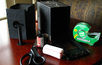 This easy-peasy modification can be used on almost any 116, 616, 127, 120, 620, etc. camera provided that the supply side of the camera will hold a canister of 35mm film. [I have a 127 camera with a supply chamber that is too narrow to hold the 35mm canister.] It's also helpful to have the correct size spool for the take-up size. For instance, I always use a 620 spool for take-up when shooting 35mm in my flipped lens Brownie Hawkeye Flash. If you happen to be working with a 116 camera (like the No 2A Brownie) and don't have the original spool, here is a great way to make a 120 spool fit a 116/616 camera.
 For this modification you'll need the camera you are choosing to use, a canister of 35mm film with the leader cut off (flat edge), tape (clear as well as electric), scissors, the empty take-up spool, and a pink sponge roller. Packs of 10-12 sponge rollers can be bought at the dollar store for, you guessed it, a buck.
Step one: Cut the foam roller to size. Size will depend on the width of the supply side of the camera, but you want to make sure that the roller pieces hold the canister snugly in place while still allowing the camera to close properly. [See image above, far left.]
Step two: Tape the film leader to the empty take-up spool and place spool in proper position. NOTE: It's helpful to do this in the darkroom, so you don't waste (expose more film than you need to).
Step three: Place film take-up/supply insert into camera or (if you are working with Holga, Diana or BHF--the foam rollers work splendidly in all these cameras!) put the camera back back on.
Importantly, you'll want to make sure that you have placed a couple layers of electric tape over the front and back of camera's red counter window so that you don't inadvertently expose the film.
The trickiest part is figuring out how to properly advance the film so that you don't get frame overlap or waste too much film. To this end, it's helpful to have a test roll of 35mm on hand. Once I have the supply and take-up sides loaded, I use a sharpie to indicate the top of the film plane. I then figure out how many turns it takes until the sharpie line moves to the bottom of the film plane. With the No 2A Brownie, it takes approximately 5 half-turns of the film advance knob to ensure that the frames will not overlap. [NOTE: As you work through the roll of film, you'll need to advance the film slightly less with each exposure to avoid frame overlap. I tend not to mind the extra space between frames, but if this bothers you, you can use the test roll of film to figure out how the exact turn count for each frame on the roll.]
The negatives from this 116 camera are about 5 inches long. With a 36 exposure roll of film, I can make approximately 9-10 images. [I load the camera in the darkroom as I want to expose as little of the film as I can.] Here is a sampling of some of the other the images made with this camera.
Subscribe to:
Comments (Atom)


